It has been a long, long wait and lots of work… finally on 11am Thursday June 8th 2017, the updated and re-designed Physiopedia site went live. With this new site design we have at long last migrated Physiopedia onto the latest version of the Mediawiki platform (the same platform Wikipedia uses) and also implemented a site design that is compatible with mobile and tablet devices that are now used for nearly 50% of visits to the site.
Benefits we have sought to achieve with the new site design include:
- Compatibility with mobile devices and smaller screens.
- Use of a new Mediawiki Visual Editor interface that facilitates page editing.
- More efficient page loading.
- Improved site security.
- Reduced design clutter and distraction to aid focus on the site content.
- Page content that is displayed using design best practices to facilitating reading.
- A modern, clean, attractive design.
- A home page that promotes the diversity and importance of the profession.
The Physiopedia team are very grateful to Hallowelt (Mediawiki specialists) and Rorie McIntosh (graphic designer) who provided the technical and creative skills that allowed this new site to be developed and implemented. We couldn’t have done all of this without the continued support of our Partners and the individuals that specifically donated to support this upgrade. We are also very grateful for all those Physiopedia team members, volunteers and site users who have provided feedback during the development process and since the site launch.
To ensure that our site users were involved in the refinement of the new design, we also provided an open feedback survey on the new site to gather initial impressions and identify issues that needed to be addressed. This survey allowed us to immediately identify and address challenges that the new design presented to some of our users. In particular this involved decreasing the original content font size, spacing and increasing page width on larger screens to assist users whose aim is to scan through content to pick out points of interest. We are now very excited to see that according to this survey the new site design is rated by 80% of Physiopedia users as Great or Awesome.
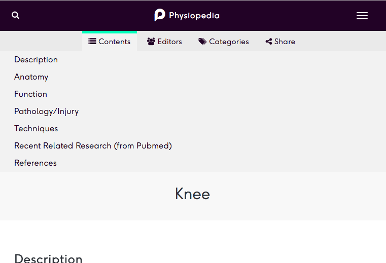
One issue that does appear to hinder some users since the release of the new design, is the new position of the page content list. This is now contained within a set of reveal tabs at the top of the page which are used to hide supplementary information about the page content (section listing, editors, categories and social media sharing links). To view this list of page sections and use the links as shortcuts to the section content, click on the Contents tab.
We are very pleased to have taken what feels like a huge step forward with this site redesign and we do hope that Physiopedia users continue to enjoy using and benefiting from the new site.
Next up is Physiopsot, then Physiopedia Plus……